We are now at the crucial stage in developing our KIWA brand identity and we now welcome your feedback.
Our design partners have developed FOUR distinct concepts that reflect what you have fed back to us about Te Haikura a KIWA.
We are now opening an online Community Survey, which will be open until 12:00pm Thursday, November 27th, 2025.
Your input is vital. Your voice will guide the final design choice and ensure that the KIWA brand truly resonates with the community it serves.
Please take 5 minutes to review the concepts below (click on image to enlarge) and complete the survey.
Thank you for helping us shape the visual identity of KIWA.
Ngā mihi nui,
Tina Filipo Tumuaki
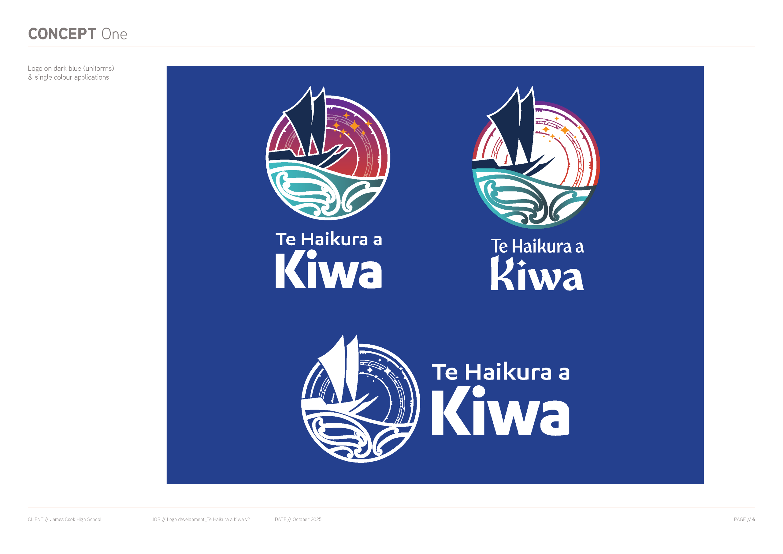
CONCEPT ONE
Click to enlarge image
The tohu incorporates the spirit of voyaging through the references to the circular star maps in the sky. The whakarare pattern within the star maps symbolises continuity and the development of concepts over time. Matariki is shown as a guide and an aspirational journeying point.
The double-hull waka shows partnership between tangata whenua and tangata tiriti, and the forward movement of our students towards an evolving future.
The koru and puhoro in the ocean show the many migration pathways into Aotearoa, and the diverse nature of our school community. The pattern enfolds one within another showing the nurture of relationships within the school – student, whānau, teachers and staff. A subtle nod to Kiwa is included in 1a.
Note: Vertical and landscape versions of the tohu allows for consistent branding across multiple platforms and uses.
Wordmark variations:
1a: The modern rounded typeface complements the koru waves in the ocean while the clean geometric shapes pick up the sharp edges of the star map.
1b: The wordmark brings to mind the organic forms and flowing lines of whakairo. The dot on the ‘i’ echoes the matariki star forms, while the ‘k’ alludes to the double sails.
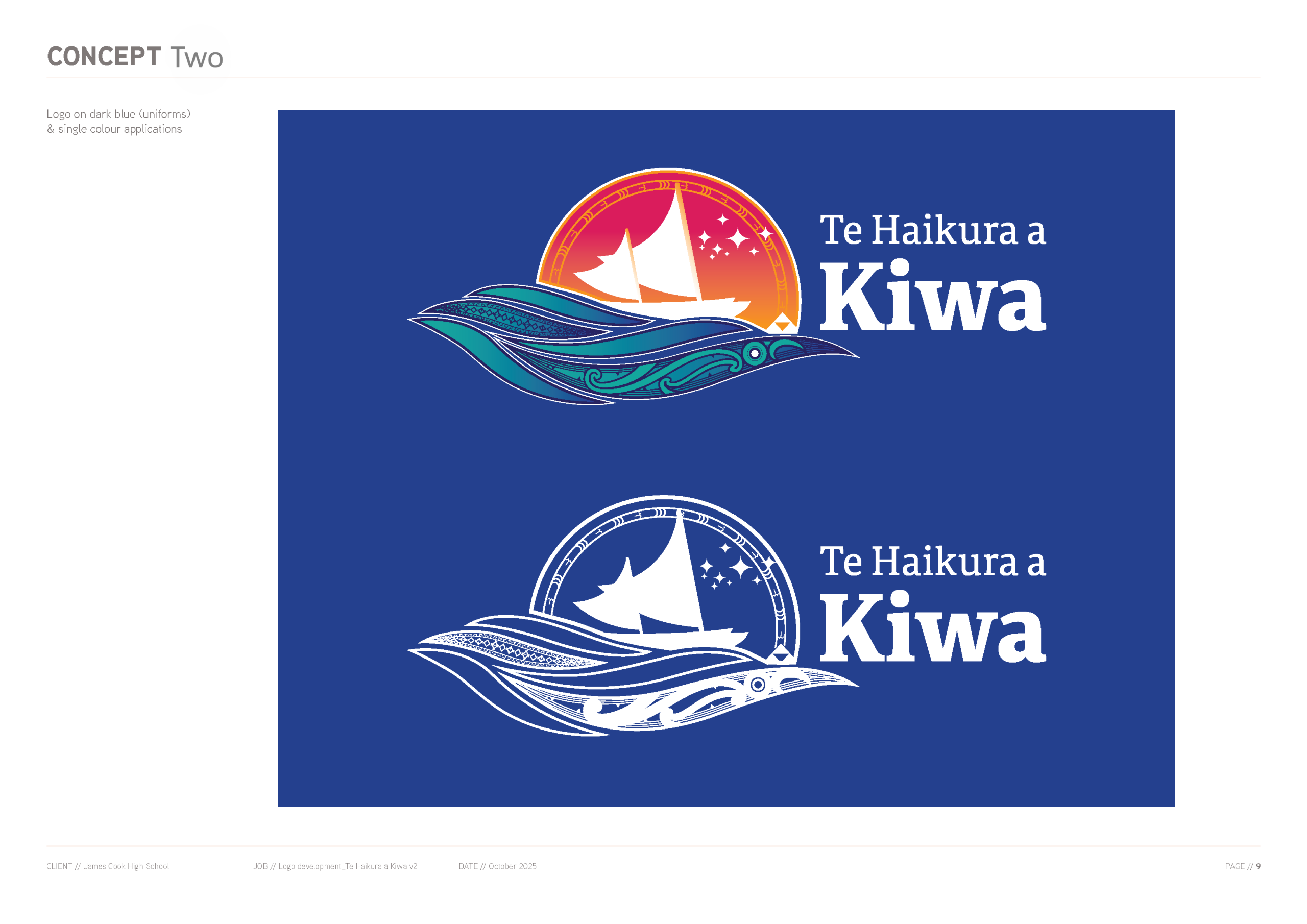
CONCEPT TWO
Click to enlarge image
Concept two has free flowing ocean waves connecting it visually with the Fale Moana logo. There are five waves symbolising the five years of study at our kura.
Kiwa is shown as a manaia – guardian and protector of our akonga. Within his wave we also see haehae and niho representing the currents connecting the many islands and our diverse peoples. Within a secondary wave, pacific patterns of manulua (unity) and protection are held within marks measuring distance and voyages.
Matariki is shown again as a guide and an aspirational journeying point. In the dawn sky, the unaunahi pattern rise over our journeying double-hulled waka (partnership) and is grounded in our whenua at the end. The frigate bird incorporated in the unaunahi pattern speaks to both the migration of our ancestors, and the lifelong learning of our students. This symbolises the safety, wealth and abundance of food our akonga will be able to attain through the skills they learn while at our kura.
Wordmark variations:
2a: A clean sans serif typeface with emphasis on Kiwa draws further attention to the manaia.
2b: The serif typeface is highly readable while still providing warmth and rhythm.
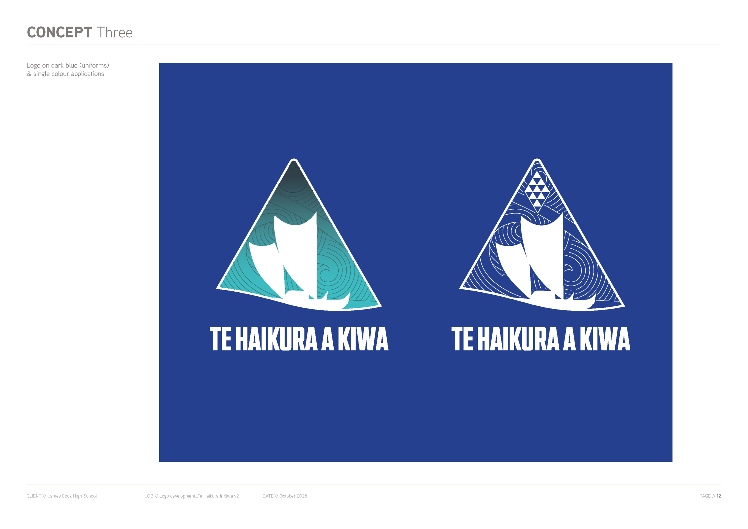
CONCEPT THREE
Click to enlarge image
Concept three is a simple waka silhouette over a pattern showing the movement of waves and wind.
Held within a triangle representing safety, shelter and connection to our whenua, a taniko design symbolises the matariki constellation. The gentle curve at the bottom of the triangle denotes the forward momentum of the waka.
Wordmark: A chunky rounded typeface in all caps grounds the tohu and anchors it in place.
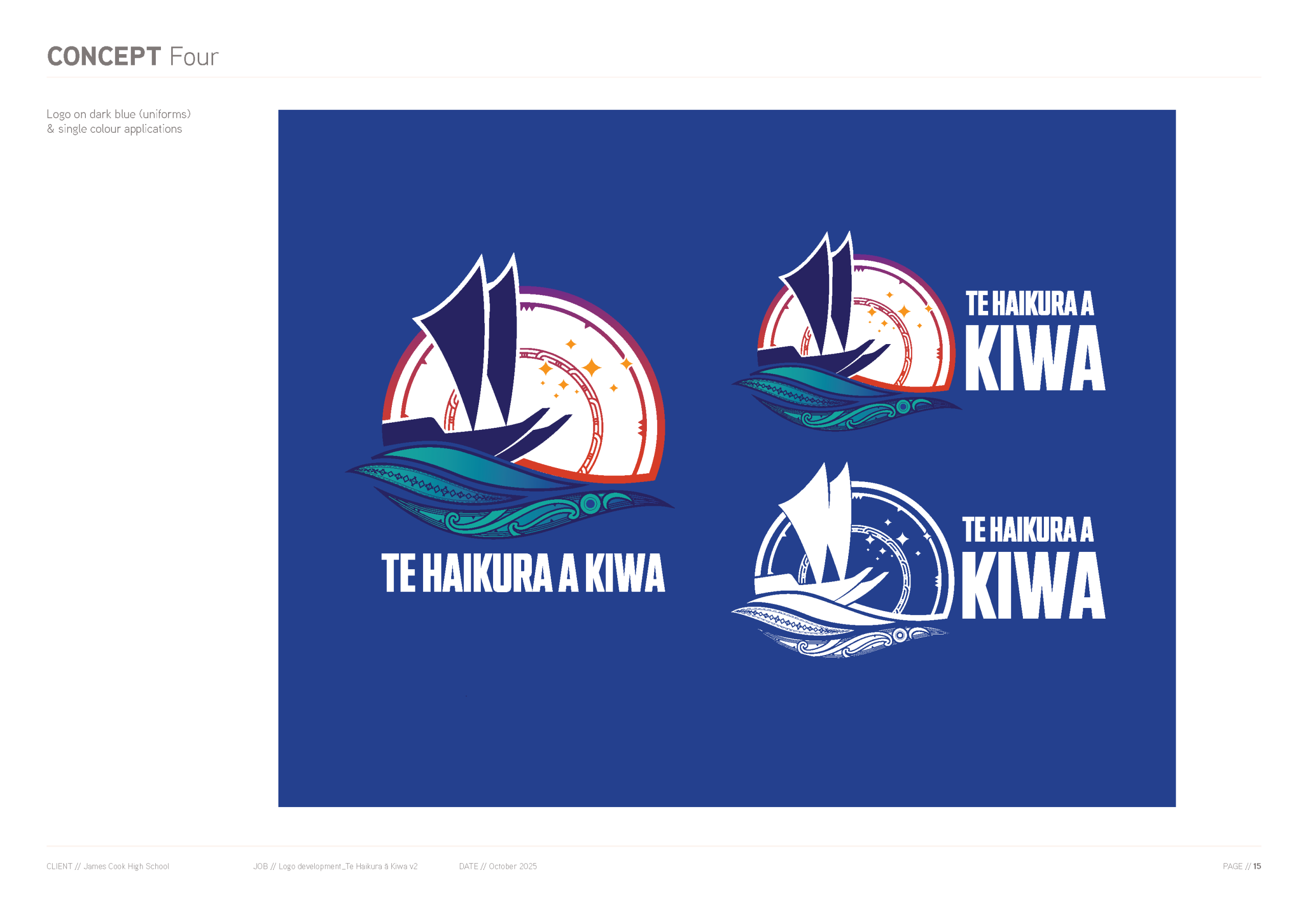
CONCEPT FOUR
Click to enlarge image
This tohu is an amalgamation of concepts one and two, pairing the twilight colours of the sky with the brighter blues of the sea.
The star map and whakarare pattern has been adjusted to allow space for the Matariki stars to be clearly visible in the sky.
The number of waves has been reduced for a more balanced tohu.
Wordmark: A chunky rounded typeface in all caps grounds the tohu and anchors it in place.